Course 4 — #courses
Note
Workflow labs use the variant template: Goal → Approach → Execution → Check → Report.
n_neighbors / perplexity and see the visual effect.PCA from Session 3; basic notion of neighbour graphs.
UMAP and t-SNE are nonlinear embedding methods widely used in single-cell and imaging biomedicine. Both build a neighbour graph in high dimensions and then try to match a lower-dimensional graph with similar neighbour structure. They are not clustering algorithms, and distances in the embedding are not Euclidean distances in the original space. The prominent visual clusters in a UMAP often exist in the data, but the distance between clusters is close to meaningless and the density inside a cluster is not comparable across clusters.
t-SNE emphasises local structure; UMAP, with default settings, is a little more faithful to global structure but can still distort. Both have knobs — perplexity for t-SNE, n_neighbors and min_dist for UMAP — that change the resulting picture substantially. A reviewer who sees only one embedding has no way to tell if the picture is a stable feature of the data or an artefact of the settings.
Treat UMAP/t-SNE as a visualisation of neighbourhood structure, not as a geometric truth. Do not run statistical tests on the coordinates. Do not claim a trajectory unless you used a trajectory method.
Embed a simulated high-dimensional dataset with three blobs into two dimensions using UMAP and t-SNE, and compare against PCA.
emb_pca <- prcomp(X)$x[, 1:2]
emb_umap <- umap(X, n_neighbors = 15, min_dist = 0.1)
emb_tsne <- Rtsne(X, perplexity = 30, check_duplicates = FALSE)$Y
df <- bind_rows(
tibble(method = "PCA", x = emb_pca[, 1], y = emb_pca[, 2], lbl = lbl),
tibble(method = "UMAP", x = emb_umap[, 1], y = emb_umap[, 2], lbl = lbl),
tibble(method = "tSNE", x = emb_tsne[, 1], y = emb_tsne[, 2], lbl = lbl)
)
ggplot(df, aes(x, y, colour = lbl)) +
geom_point(alpha = 0.7, size = 0.8) +
facet_wrap(~ method, scales = "free") +
labs(x = NULL, y = NULL)
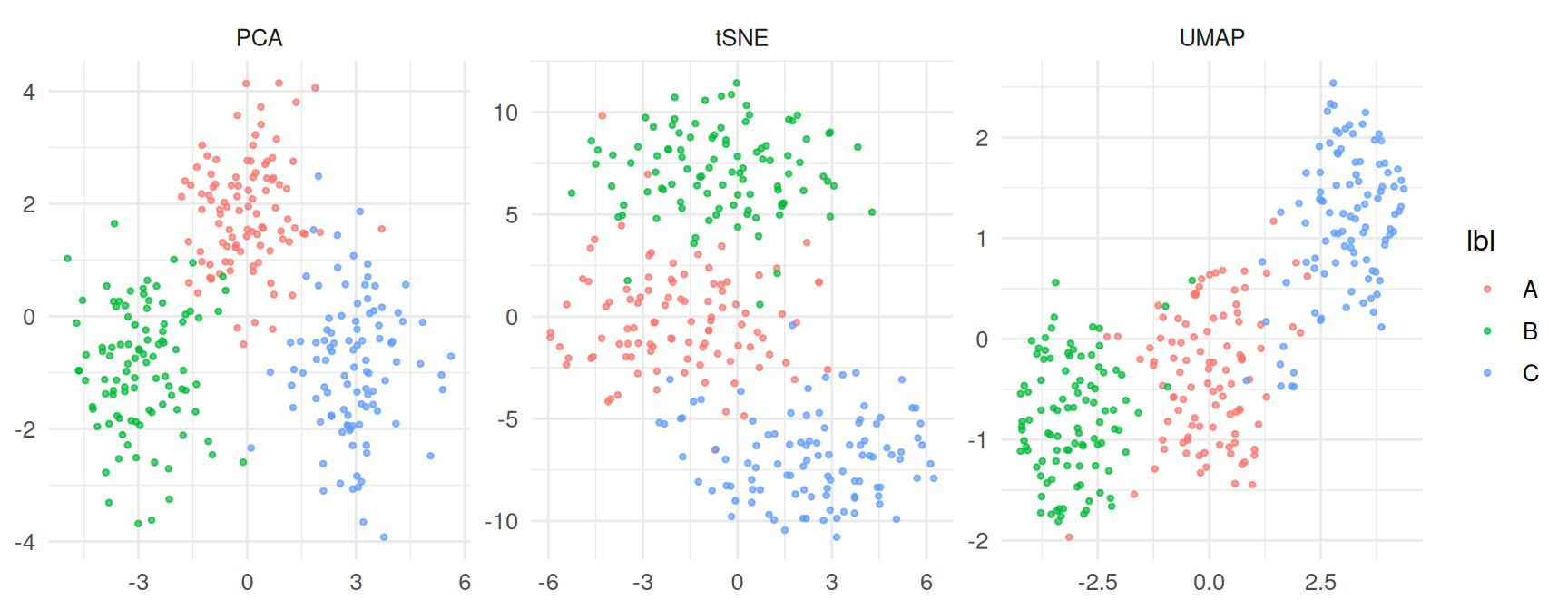
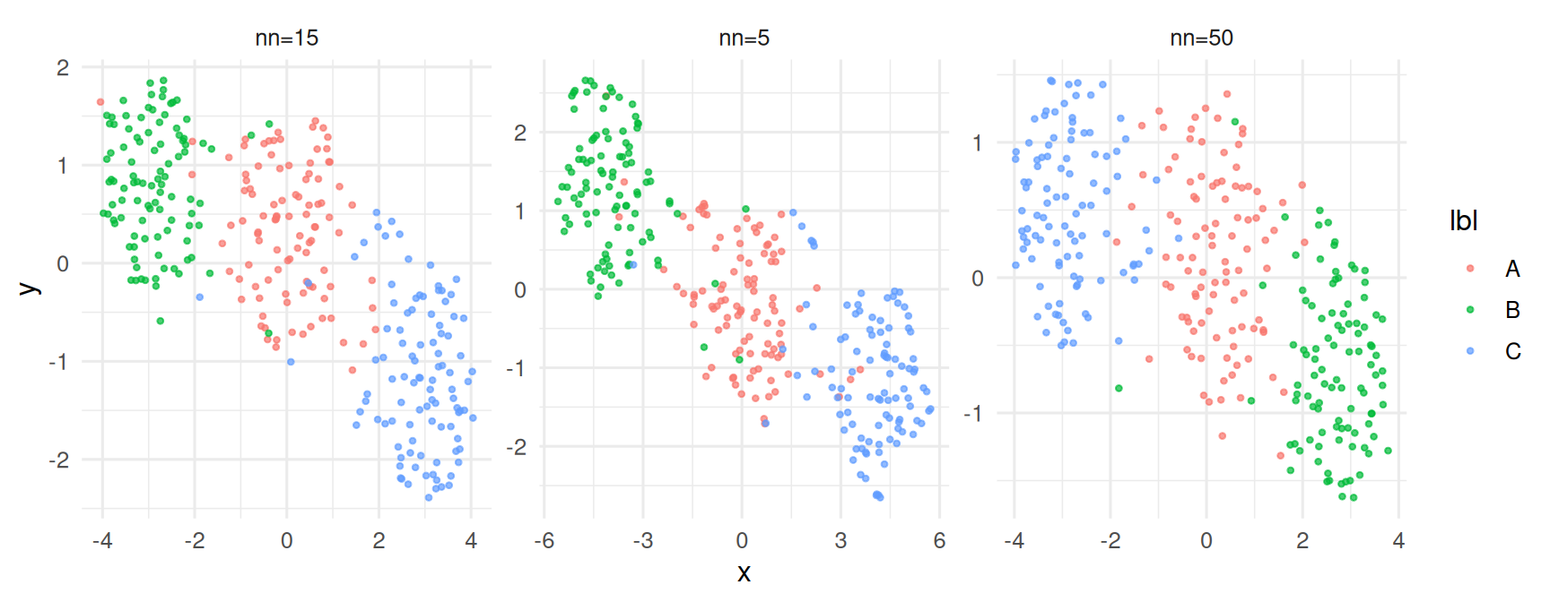
Sensitivity to n_neighbors.
Both UMAP and t-SNE recovered the three simulated blobs as distinct visual clusters; PCA separated them more weakly because the signal lay along two of 20 dimensions. UMAP embeddings with
n_neighbors∈ {5, 15, 50} all identified the same three groups but differed substantially in their relative layout.
The message is not which method is best, but that the embedding is best used as a visual companion, with another method — clustering, classification, or differential analysis — doing the statistical work.
R version 4.4.1 (2024-06-14)
Platform: x86_64-pc-linux-gnu
Running under: Ubuntu 24.04.4 LTS
Matrix products: default
BLAS: /usr/lib/x86_64-linux-gnu/openblas-pthread/libblas.so.3
LAPACK: /usr/lib/x86_64-linux-gnu/openblas-pthread/libopenblasp-r0.3.26.so; LAPACK version 3.12.0
locale:
[1] LC_CTYPE=C.UTF-8 LC_NUMERIC=C LC_TIME=C.UTF-8
[4] LC_COLLATE=C.UTF-8 LC_MONETARY=C.UTF-8 LC_MESSAGES=C.UTF-8
[7] LC_PAPER=C.UTF-8 LC_NAME=C LC_ADDRESS=C
[10] LC_TELEPHONE=C LC_MEASUREMENT=C.UTF-8 LC_IDENTIFICATION=C
time zone: UTC
tzcode source: system (glibc)
attached base packages:
[1] stats graphics grDevices utils datasets methods base
other attached packages:
[1] Rtsne_0.17 uwot_0.2.4 Matrix_1.7-0 lubridate_1.9.5
[5] forcats_1.0.1 stringr_1.6.0 dplyr_1.2.1 purrr_1.2.2
[9] readr_2.2.0 tidyr_1.3.2 tibble_3.3.1 ggplot2_4.0.3
[13] tidyverse_2.0.0
loaded via a namespace (and not attached):
[1] gtable_0.3.6 jsonlite_2.0.0 compiler_4.4.1 Rcpp_1.1.1-1.1
[5] tidyselect_1.2.1 FNN_1.1.4.1 scales_1.4.0 yaml_2.3.12
[9] fastmap_1.2.0 lattice_0.22-6 R6_2.6.1 labeling_0.4.3
[13] generics_0.1.4 knitr_1.51 htmlwidgets_1.6.4 pillar_1.11.1
[17] RColorBrewer_1.1-3 tzdb_0.5.0 rlang_1.2.0 stringi_1.8.7
[21] xfun_0.57 S7_0.2.2 otel_0.2.0 timechange_0.4.0
[25] cli_3.6.6 withr_3.0.2 magrittr_2.0.5 digest_0.6.39
[29] grid_4.4.1 hms_1.1.4 lifecycle_1.0.5 vctrs_0.7.3
[33] RSpectra_0.16-2 evaluate_1.0.5 glue_1.8.1 farver_2.1.2
[37] rmarkdown_2.31 tools_4.4.1 pkgconfig_2.0.3 htmltools_0.5.9