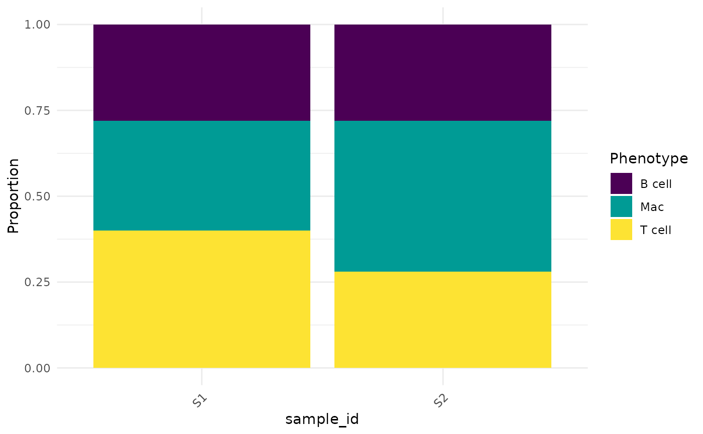
Stacked bar plot showing the proportion or count of each phenotype within each sample (or other grouping variable). Matches the stacked bar composition plots from the images.
Arguments
- object
An
SpatialCellDataobject with aphenotypecolumn.- group_by
Character. Metadata column for the x-axis grouping. Default
"sample_id".- proportion
Logical. Show proportions instead of counts? Default
TRUE.- colours
Named character vector or
NULL.
Examples
counts <- matrix(rnorm(100), nrow = 50,
                 dimnames = list(NULL, c("CD3", "CD8")))
coords <- data.frame(x = runif(50), y = runif(50))
meta <- data.frame(cell_id = 1:50,
                   sample_id = rep(c("S1", "S2"), each = 25),
                   phenotype = sample(c("T cell", "B cell", "Mac"), 50, TRUE))
obj <- CreateSpatialObject(counts, coords, meta)
CompositionPlot(obj)