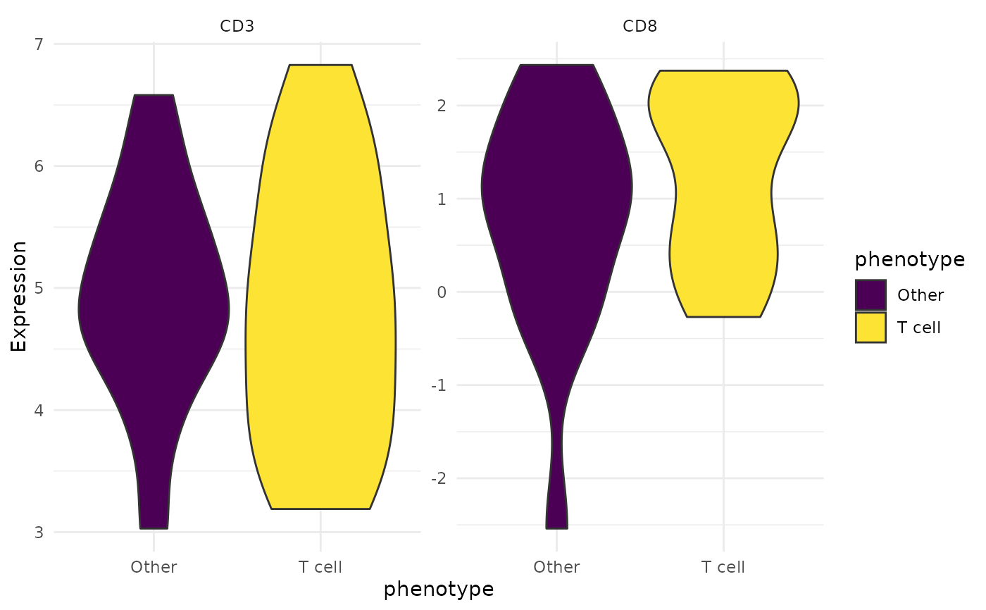
Violin plot showing the distribution of marker expression across phenotypes or other grouping variables.
Usage
ViolinPlot(
  object,
  features,
  group_by = "phenotype",
  slot = "data",
  colours = NULL,
  ncol = NULL,
  pt_size = 0
)
Arguments
- object
An
SpatialCellDataobject.- features
Character vector. Marker names to plot.
- group_by
Character. Metadata column to group by. Default
"phenotype".- slot
Character.
"data"or"counts".- colours
Named character vector or
NULL.- ncol
Integer or
NULL. Number of columns for facets.- pt_size
Numeric. Jitter point size.
0to hide. Default0.
Examples
counts <- matrix(c(rnorm(30, 5), rnorm(30, 1)), ncol = 2,
                 dimnames = list(NULL, c("CD3", "CD8")))
coords <- data.frame(x = runif(30), y = runif(30))
meta <- data.frame(cell_id = 1:30, sample_id = "s1",
                   phenotype = rep(c("T cell", "Other"), each = 15))
obj <- CreateSpatialObject(counts, coords, meta)
ViolinPlot(obj, features = c("CD3", "CD8"))