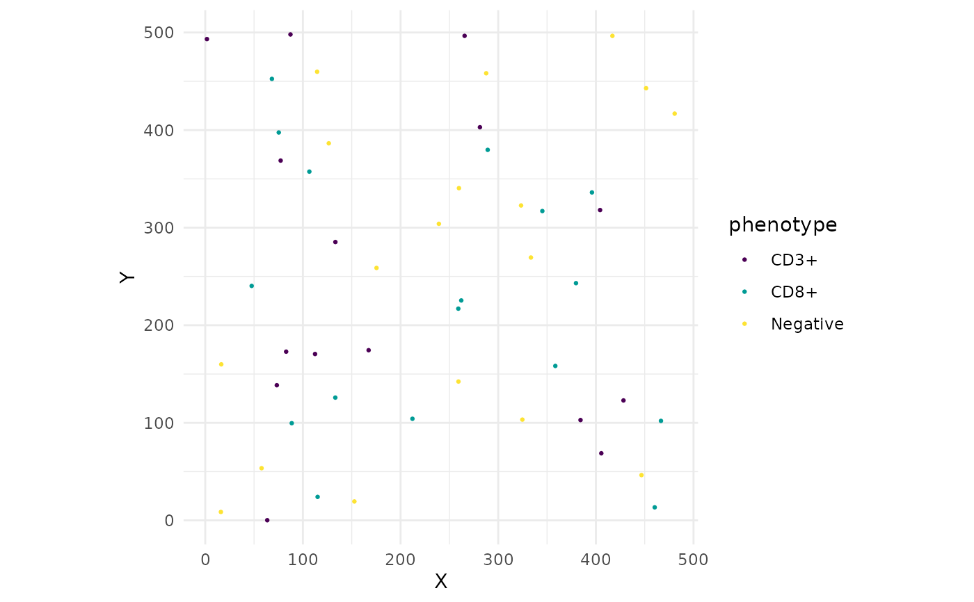
Creates a scatter plot of cell positions, coloured by phenotype or cluster.
Usage
plot_cell_map(
  dt,
  colour_by = "phenotype",
  colours = NULL,
  point_size = 0.5,
  title = NULL
)
Arguments
- dt
A data.table with columns x and y.
- colour_by
Character string. Column name to colour cells by.
Default "phenotype".
- colours
Named character vector of colours, or NULL for automatic
colours.
- point_size
Numeric. Size of plotted points. Default 0.5.
- title
Character string or NULL. Plot title.
Examples
dt <- data.table::data.table(
  sample_id = "s1", cell_id = 1:50,
  x = runif(50, 0, 500), y = runif(50, 0, 500),
  phenotype = sample(c("CD3+", "CD8+", "Negative"), 50, replace = TRUE)
)
plot_cell_map(dt)